
Available with any of the following subscriptions:
-
Enterprise
Note: The weekly report is emailed (by Tuesday) to confirmed recipients. Contact support@fooddocs.com to enable it.
1. Weekly Company Completion Trend
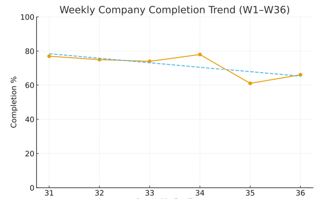
What the chart shows
- Y-axis: Completion percentage
- X-axis: Calendar weeks
- Orange dots: Actual weekly completion
- Blue dashed line: Trendline
Example insights:
- The company was performing steadily (75–78%) for the first four weeks, but Week 35 marks a clear drop.
- The partial recovery in Week 36 suggests the issue may have been temporary but not fully resolved.
- The negative slope of the trendline indicates that if nothing changes, the company’s completion percentage may continue decreasing.
2. Weekly Region Completion Trend
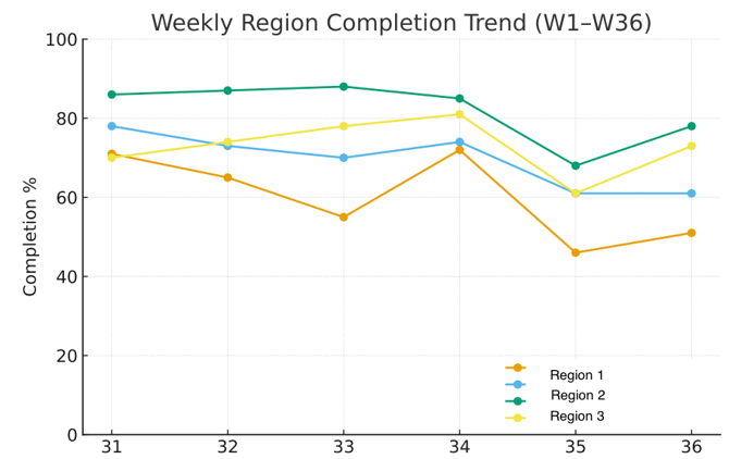
What the chart shows
- Y-axis: Completion percentage
- X-axis: Calendar weeks
- Colored lines for each region: Represent task completion for Region 1 (orange), Region 2 (green), Region 3 (yellow), and Region 4 (blue).
Example insights:
- Week 35 is critical: All three regions saw a significant drop in completion that week. This suggests a company-wide or external factor (e.g., staffing issues, holidays, supply disruptions).
- Region 2 leads overall: Despite dips, Region 2 consistently performs 10–20% above Regions 1 and 3.
- Region 1 underperforms: Completion rates are significantly lower and more volatile compared to the others.
- Region 3 is moderate: Performs better than Region 1, but below Region 2, with a more stable trend.
- This chart allows you to identify which region needs the most support (Region 1) and which one sets the benchmark (Region 2).
3. Weekly Task Completion by Locations
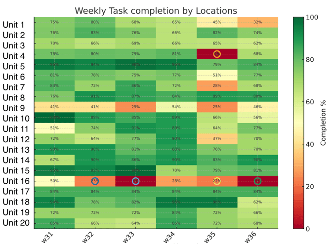
What the chart shows
-
Y-axis (Units 1–20): Individual company locations.
-
X-axis (W31–W36): Calendar weeks
-
Colors: Represent completion % (green = high, yellow = medium, red = low).
-
Numbers inside each cell: Exact completion % for that unit and week
Example insights:
- Critical attention needed: Unit 16 (very low completion, including 0%) and Unit 9 (chronic underperformance).
- Company-wide dip in W35: Indicates a broader operational challenge that week.
- Top performers (Units 5, 13, 15, 18): Can serve as role models for processes and training.
- Action point: Compare resources, staffing, or procedures between low- and high-performing units to identify improvement opportunities.
4. Heatmap of Deviation Rates by Locations and Task Group
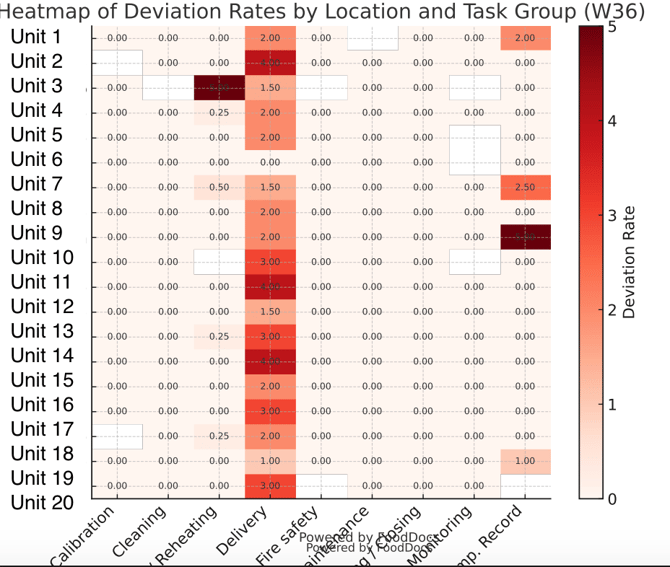
What the chart shows
- Y-axis (Units 1–20): Locations.
- X-axis (Task groups): Categories such as Calibration, Cleaning, Reheating, Delivery, Fire Safety, etc.
- Color scale (white → dark red): Deviation rate, where darker red = higher number of deviations.
-
Numbers inside cells: Actual deviation counts per unit and task group.
Example insights:
- Delivery is the main weak spot: This suggests issues with how deliveries are checked, recorded, or standards enforced. A process review or refresher training may be needed.
- Fire safety requires attention in specific units: Especially Units 9, 12, 14, 16, 19. Could indicate missing checks, skipped records, or lack of follow-up.
- High-risk units: Units 9, 12, 14, 15, 16, 19 should be prioritized for corrective actions.
- Strong performers: Units with no deviations (e.g., 6, 13, 18) can serve as examples of best practices.
5. Overall Management Insights
Example insights:
Company (W1–W36)
- Average completion: 82.6%
- Trend change: –10.0 pts (from 75.0% in W1 → 65.0% in W36)
- Compliance has been declining across the 36 weeks.
Regions (W36)
- Best performers:
- Region 1: 77.2%
- Region 2: 72.8%
- Region 3: 58.2%
- Weakest region:
- Region 4: 49.6%
Locations (W36)
- Top 5 locations:
- Location 1 → 90.2%
- Location 2 → 88.2%
- Location 3 → 84.5%
- Location 4 → 84.5%
- Location 5 → 80.9%
- Bottom 5 locations:
- Location 6 → 0.0% ❗
- Location 7 → 31.5%
- Location 8 → 42.9%
- Location 9 → 56.0%
- Location 10 → 61.5%
Recommendations
- Red→green weekly reviews
- Use the heatmaps to target the bottom 5 sites and worst task groups.
- Assign local leads and 2-week action plans.
- Peer coaching
- Pair underperformers like Location 1 (0%) with top sites like Location 2 (90%).
- Encourage best practice sharing.
- Task group focus
- Urgently improve Calibration and Delivery, as both show low completion & high deviations.
- Add mid-week spot checks to verify progress.
- Celebrate wins
- Recognize consistently strong sites (Loc 1, Loc 2, Loc 3).
- Publicly celebrate week-over-week improvements to boost morale.
- Root cause investigations
- For deviations, collect why issues occurred (e.g., lack of tools, unclear SOPs, time pressure).
- Feed into SOP updates and training.